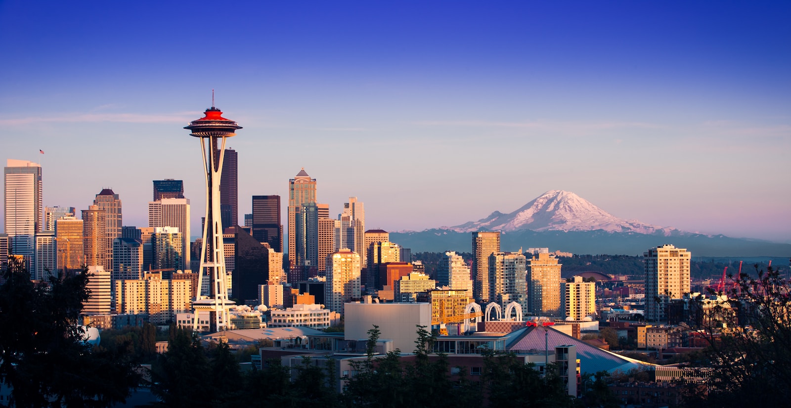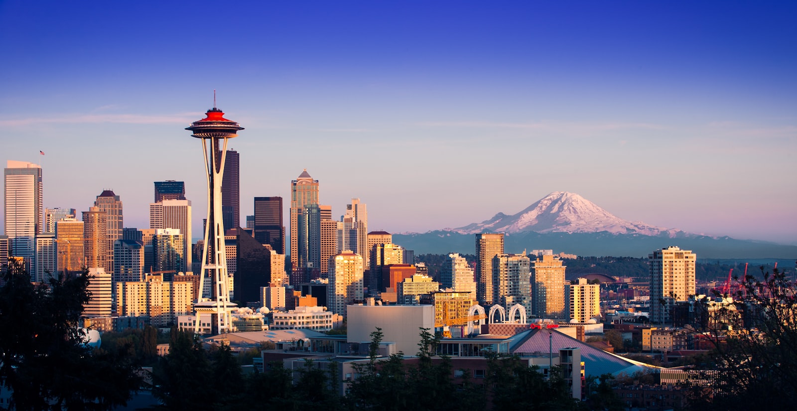
Before the Needle, Seattle’s skyline was a shoreline argument among hills, cranes, and mid-rise blocks. After 1962, the argument gained a protagonist.
Skylines are not only height. They are rhythm, gap, and the one form that teaches the eye where “here” begins. The Space Needle became that teacher. Even as downtown densified with glass towers decades later, the Needle retained a privileged role: the eccentric accent that keeps the composition from becoming generic North American CBD.
Postcards, ferries, and the portable city
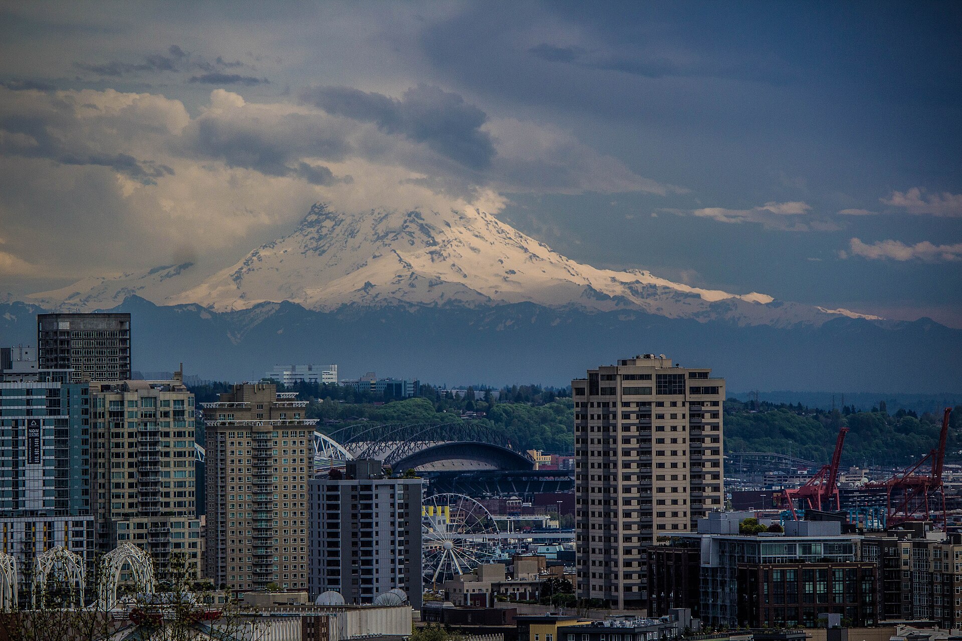
Photography did half the work. From Kerry Park, from Bainbridge ferries, from Interstate approaches, the Needle organizes the frame. Mountains may vanish in cloud; glass may glare; the tripod remains readable. That reliability turned architecture into civic branding long before “branding” was everyday vocabulary.
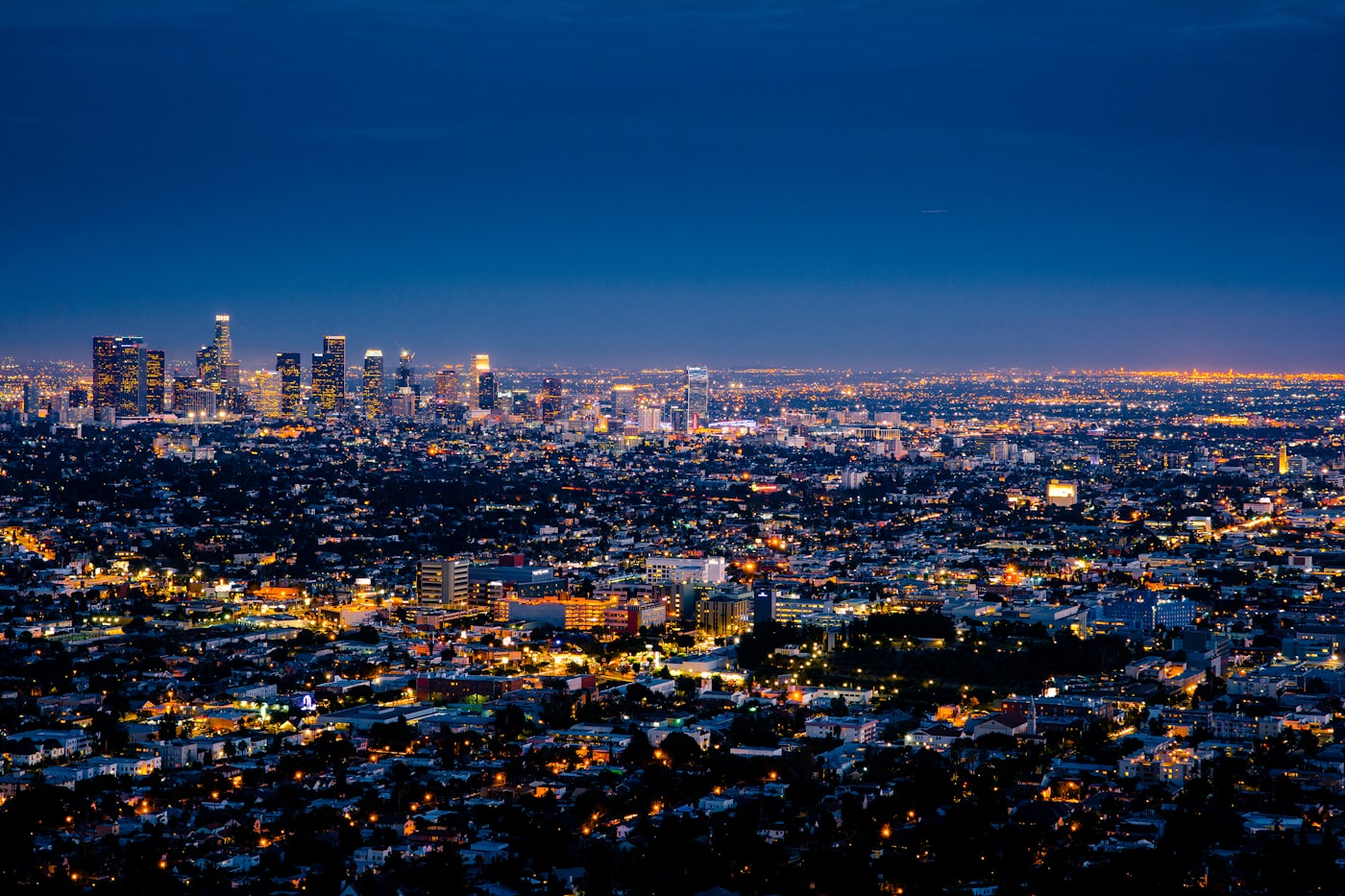
Density arrives; the accent remains
Late-twentieth and early-twenty-first-century growth multiplied rectangles. South Lake Union and downtown cores pushed height into new registers. Yet the Needle’s eccentricity—its non-orthogonal joy—still interrupts the grid. In urban design terms, it is a landmark in Kevin Lynch’s sense: a reference that orients memory as much as navigation.
1962 Journal treats the skyline as a cultural text. The Needle is not the tallest line in that text. It is the italicized one—the phrase readers still underline.