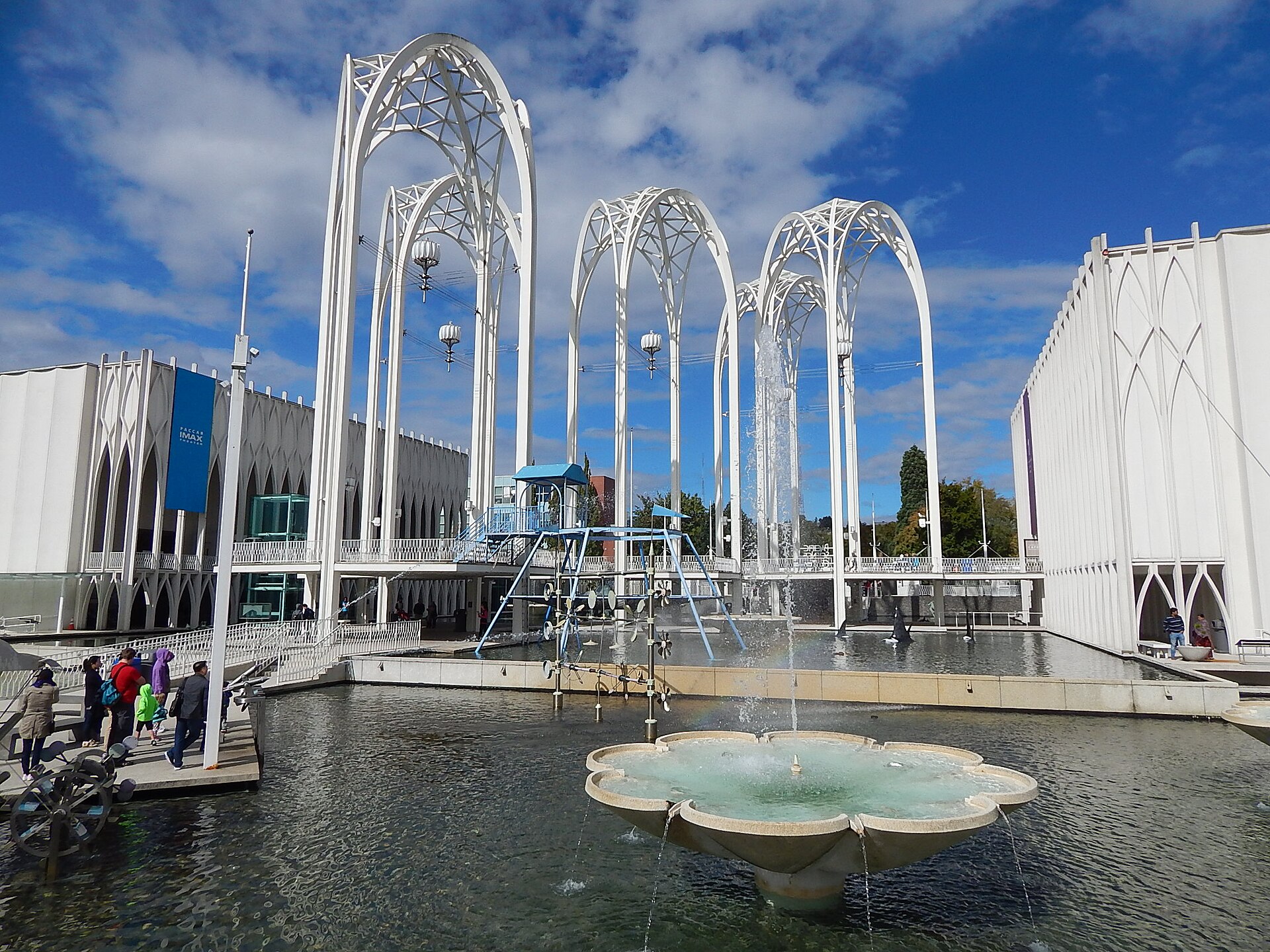
Century 21 had a soundtrack of optimism and a wardrobe of metal. Its look—gold, orange signals, white steel, orbital graphics—still telegraphs “Seattle 1962” faster than any paragraph.
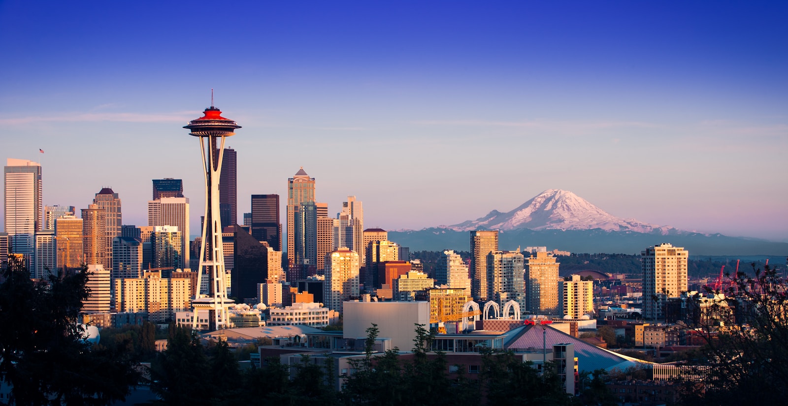
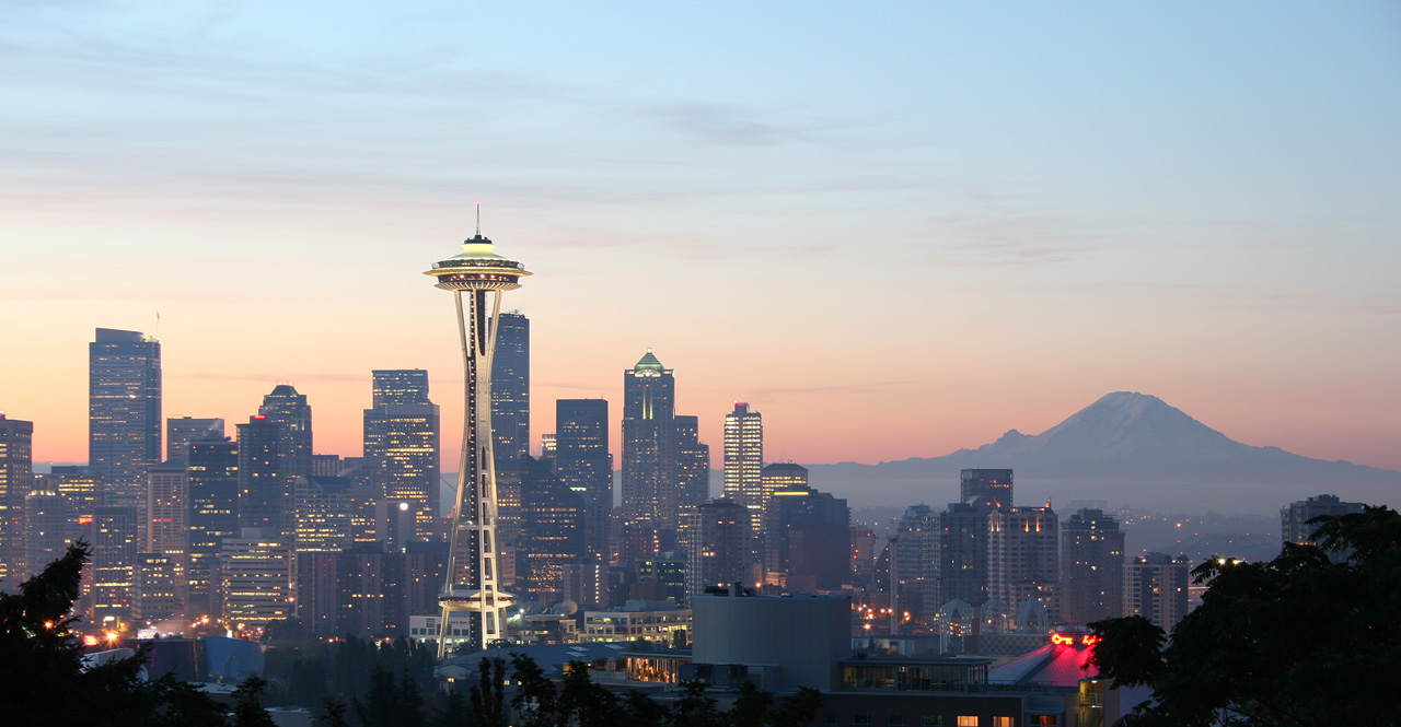
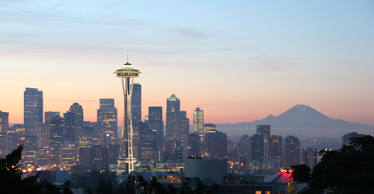
Visual culture is how a fair teaches itself to strangers. Typography leaned modern; posters promised lift-off; pavilion façades preferred curves that hinted at capsules and radar. The Space Needle concentrated those cues into one object: a chrome-era silhouette that photographed as icon even in rain.
Palette as propaganda for hope
Mid-century world’s fairs often used color as emotional logistics. Bright accents moved crowds; metallic finishes suggested aerospace proximity; clean whites implied hygiene and progress. Seattle’s version layered those tricks onto a gray-climate city, which made the accents feel even more deliberate—like highlighter on overcast days.
Afterlives in design memory
Retro-futurism today borrows freely from Century 21’s vocabulary—sometimes sincerely, sometimes as costume. 1962 Journal prefers the sincere read: these colors and curves were tools for explaining a city’s ambitions. Understanding them is part of understanding why the Needle still looks like a sentence written in the future tense.